Pop Tonic
Redefining Tonic Water for the Modern Consumer.
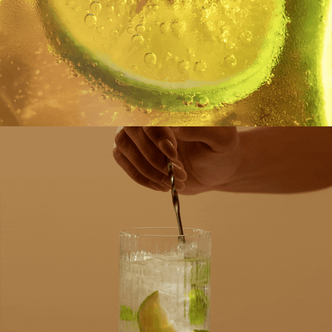
Pop Tonic set out to revolutionise the tonic water market by targeting a new generation of drinkers. Our goal was to create an approachable, fresh, and vibrant brand identity that would resonate with this audience and set Pop Tonic apart from the competition.
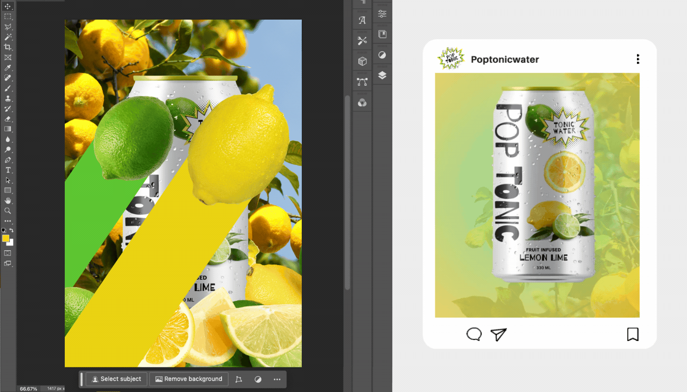
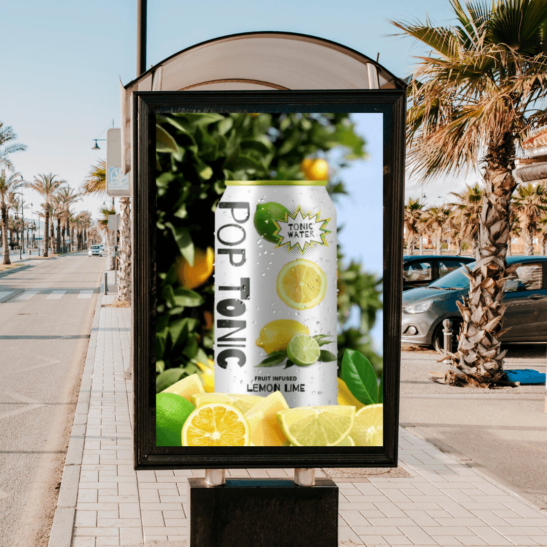
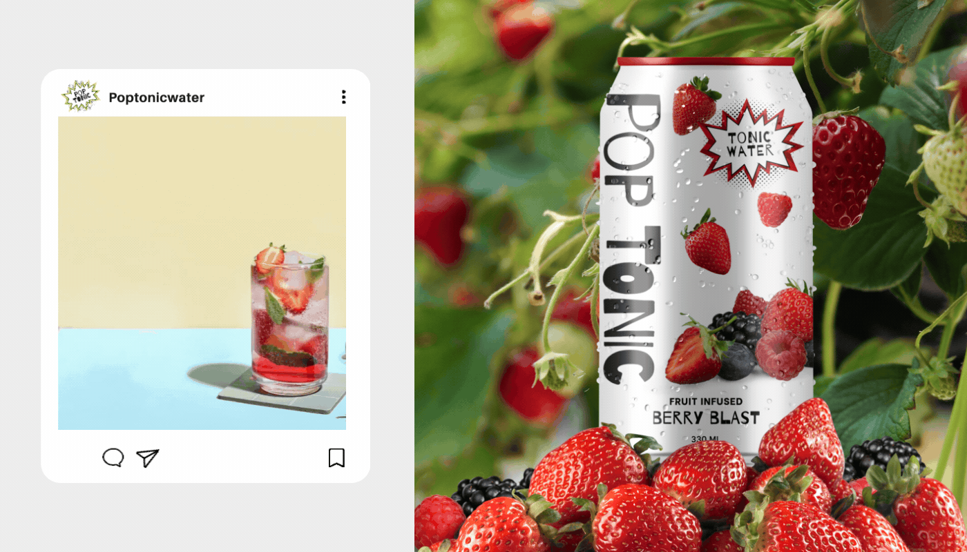
Drawing inspiration from pop art, the design reflects the sharp, crisp, and fizzy characteristics of tonic water. The use of the Barrio typeface, with its varying weights, captures Pop Tonic's vibrant personality. A bold color palette ensures the brand stands out without overwhelming the senses. This approach infuses energy and excitement into the brand, making Pop Tonic easily distinguishable on shelves, online, and in person.
Client
Self initiated
Year
2023
Scope
Brand Strategy, Visual Identity, Packaging Design, Campaign, Digital Design