Dough Co.
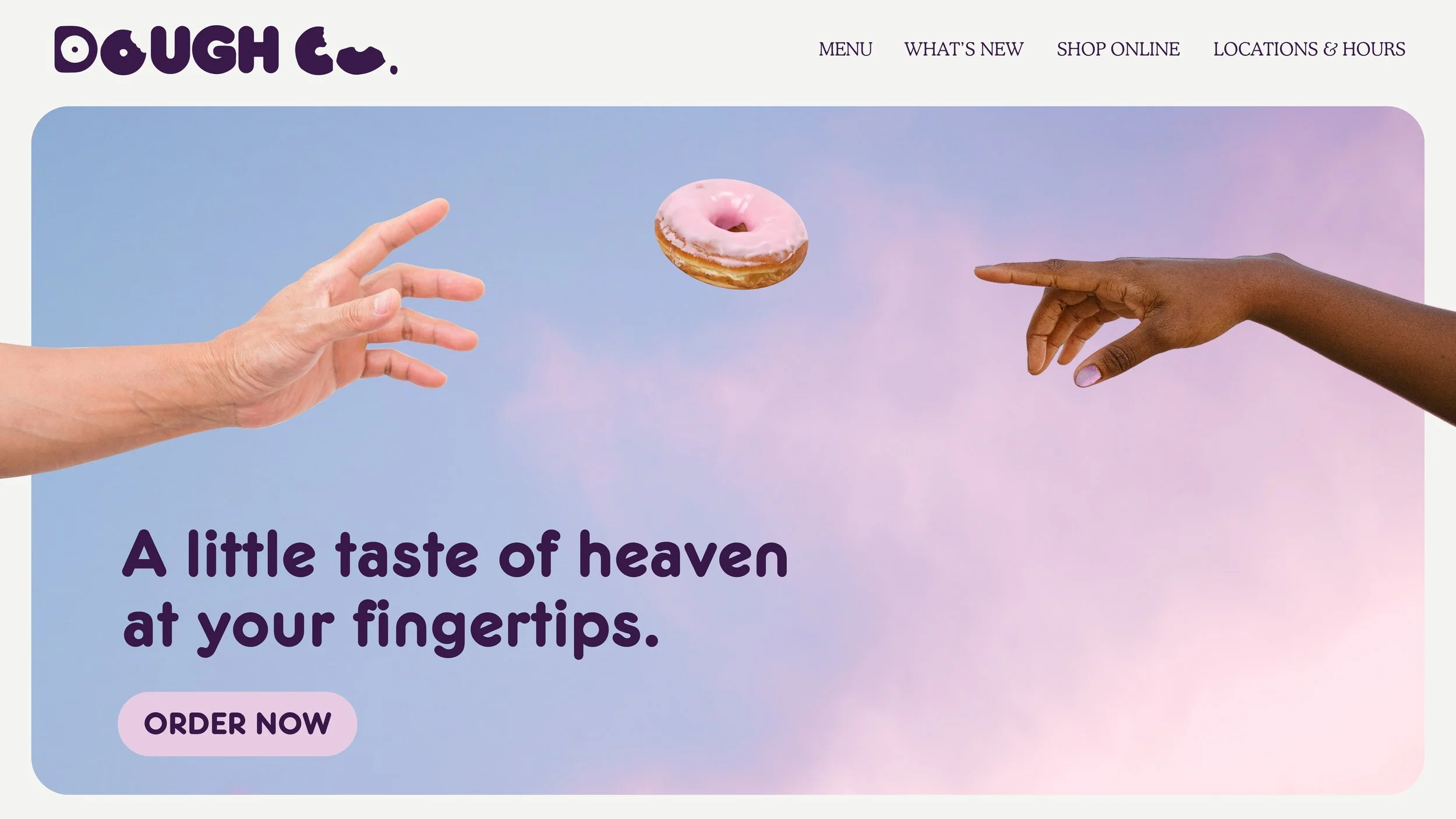
A Little Taste of Heaven.
With a focus on blending delightful flavours with a whimsical aesthetic, Dough Co creates an irresistible experience that delights both the taste buds and the eyes.
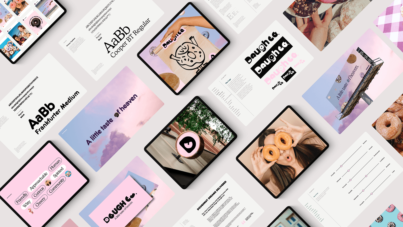
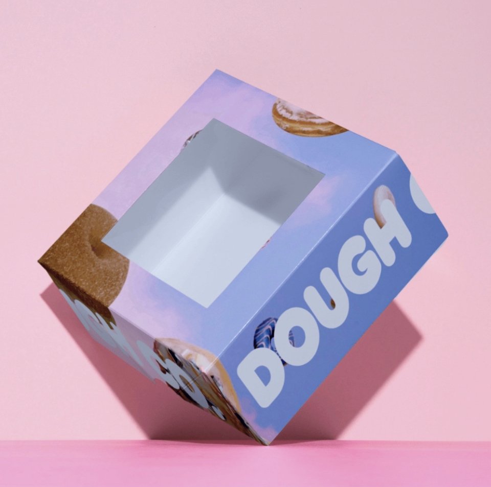
Supported by the creative vision: to bring a touch of heaven to every bite, and the brand’s ambition: to be the go-to treat for a younger audience, we brought Dough Co to life with a complete visual identity. The logo features a rounded typeface with doughnut shapes and negative space in the letter "D," paired with a serif typeface and a cotton candy sky-inspired colour palette. This design extends across all brand channels and touch points, including playful packaging, eye-catching EDMs, social media graphics, website banners, in-store signage, and merchandise. The result is a cohesive and enchanting brand experience that captures attention and fosters loyalty, without overshadowing Dough Co’s heavenly delights.
Client
Self-Initiated
Year
2023
Scope
Brand Strategy, Visual Identity, Packaging, Social + Campaign